

The branding concept for this bar harmoniously merges Hong Kong's urban edge with refined sophistication, drawing inspiration from its location on Fa Gai Street – historically known as the "Flower Street" in Cantonese. The design solution juxtaposes a bold, industrial-inspired typeface with a subtle floral motif rendered in abstract geometric forms, creating visual tension between raw energy and delicate beauty. This duality reflects the venue's identity as both an intimate floral-inspired cocktail lounge and a vibrant nightlife destination, honoring the street's botanical heritage while nodding to the dynamic energy concealed behind its doors. The monochromatic color scheme with metallic accents further reinforces this balance of grit and glamour, creating a brand identity that whispers its floral history through design details while shouting its contemporary character through bold typographic statements.
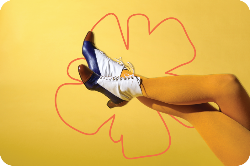
The branding concept for this bar harmoniously merges Hong Kong's urban edge with refined sophistication, drawing inspiration from its location on Fa Gai Street – historically known as the "Flower Street" in Cantonese. The design solution juxtaposes a bold, industrial-inspired typeface with a subtle floral motif rendered in abstract geometric forms, creating visual tension between raw energy and delicate beauty. This duality reflects the venue's identity as both an intimate floral-inspired cocktail lounge and a vibrant nightlife destination, honoring the street's botanical heritage while nodding to the dynamic energy concealed behind its doors. The monochromatic color scheme with metallic accents further reinforces this balance of grit and glamour, creating a brand identity that whispers its floral history through design details while shouting its contemporary character through bold typographic statements.
For this playful cocktail brand, I crafted a visual identity around two adventurous monkeys—Dav and Al—on a whimsical quest through lush forests to discover premium cocktail ingredients. Their distinct personalities (quirky, determined) anchor the brand’s fun, relatable vibe.
The dual-logo system balances versatility:
A structured geometric logo for box packaging (sleek, premium appeal)
A fluid hand-drawn logo for cans (energetic, approachable)
Vibrant colors, dynamic illustrations, and bold typography create shelf-stopping designs for bars and retailers, seamlessly blending storytelling with bold visual impact.
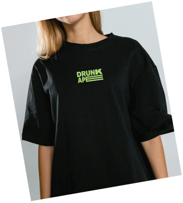
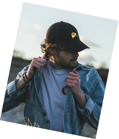
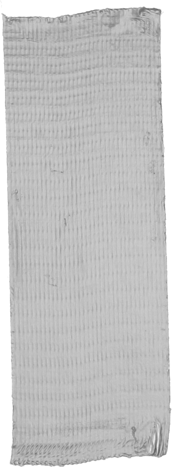


For this project, we were commissioned to develop a complete branding package and bandana design for Scruff, a personalized dog bandana brand that transforms everyday pet accessories into bold style statements. The client envisioned a brand identity that was anything but ordinary, with a nostalgic nod to the vibrant energy of 90s hip-hop culture.
Our approach combined playful creativity with a strong sense of individuality, crafting designs that celebrate self-expression for both pets and their owners. The bandana designs reflect the bold patterns and dynamic spirit of the 90s, blending retro aesthetics with modern flair. The branding extends beyond the product itself, emphasizing Scruff’s commitment to quality, uniqueness, and giving back to the community through donations to local shelters.
Every detail of the project was designed to align with Scruff’s ethos: handmade craftsmanship, personalization options for a custom touch, and limited-edition designs that make each piece truly exclusive. The result is a cohesive brand identity that not only captures attention but also resonates with pet lovers who value style, individuality, and purpose.
The branding concept for this bar harmoniously merges Hong Kong's urban edge with refined sophistication, drawing inspiration from its location on Fa Gai Street – historically known as the "Flower Street" in Cantonese. The design solution juxtaposes a bold, industrial-inspired typeface with a subtle floral motif rendered in abstract geometric forms, creating visual tension between raw energy and delicate beauty. This duality reflects the venue's identity as both an intimate floral-inspired cocktail lounge and a vibrant nightlife destination, honoring the street's botanical heritage while nodding to the dynamic energy concealed behind its doors. The monochromatic color scheme with metallic accents further reinforces this balance of grit and glamour, creating a brand identity that whispers its floral history through design details while shouting its contemporary character through bold typographic statements.
CREPES &
BAKES

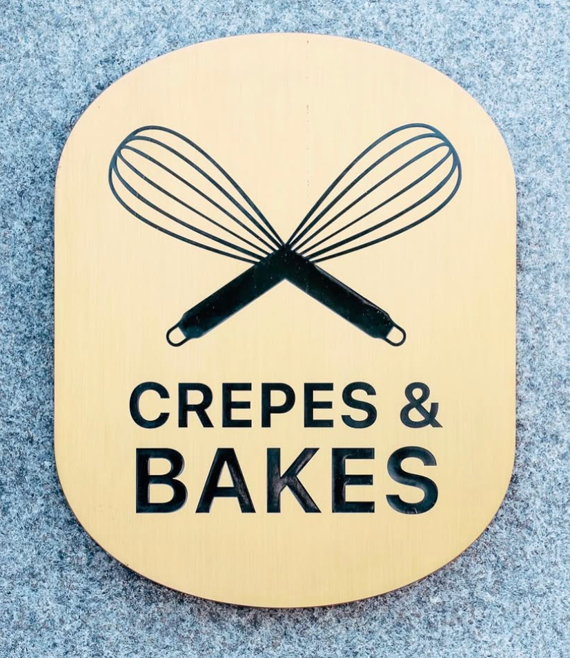

For this project, the client envisioned an authentic bakery feel, and it was important to align the design with their vision. They wanted a recognizable logo for their venue that clearly represented their cuisine. The whisk, as one of the most iconic tools for bakers, became the central symbol of the design, reflecting
their passion for baking.
While this project took a creative direction that wasn’t my personal favorite, I focused on delivering a solution that met the client’s expectations. In the end, the client was satisfied with the outcome, and the logo successfully captured the essence of their bakery.

For this project, we developed the branding for a podcast dedicated to exploring mental health and personality dynamics. The podcast brings together industry professionals to discuss how different personality types influence work and social interactions.
The client wanted to incorporate four specific colors, each representing different aspects of the brain. These colors play a key role in their practice, helping identify ideal career paths for candidates.
Our approach was to create bold, eye-catching branding that would stand out across streaming platforms. We chose a rounded typeface to symbolize the fluid and multifaceted nature of personalities, emphasizing that not everything in life follows a straight path.
Interaction Styles
Essential Motivators
Intentional Drivers
Cognitive Dynamics
For this project, we developed the branding for a podcast dedicated to exploring mental health and personality dynamics. The podcast brings together industry professionals to discuss how different personality types influence work and social interactions.
The client wanted to incorporate four specific colors, each representing different aspects of the brain. These colors play a key role in their practice, helping identify ideal career paths for candidates.
Our approach was to create bold, eye-catching branding that would stand out across streaming platforms. We chose a rounded typeface to symbolize the fluid and multifaceted nature of personalities, emphasizing that not everything in life follows a straight path.

For this project, the client desired a logo that was both refined and deeply rooted in authenticity—a visual identity that speaks to the sophisticated yet approachable nature of their mid-range fine dining restaurant. Drawing inspiration from the timeless architecture and storied heritage of Normandy, the design embraces classic elements that evoke a sense of history and elegance. At the same time, subtle Chinese influences have been thoughtfully integrated to resonate with the local audience, creating a harmonious fusion of cultural narratives. The resulting logo not only captures the essence of traditional charm but also infuses a modern touch, making it a distinctive emblem that reflects both the legacy of its inspirations and the vibrant energy of its community.
For this project, the client desired a logo that was both refined and deeply rooted in authenticity—a visual identity that speaks to the sophisticated yet approachable nature of their mid-range fine dining restaurant. Drawing inspiration from the timeless architecture and storied heritage of Normandy, the design embraces classic elements that evoke a sense of history and elegance. At the same time, subtle Chinese influences have been thoughtfully integrated to resonate with the local audience, creating a harmonious fusion of cultural narratives. The resulting logo not only captures the essence of traditional charm but also infuses a modern touch, making it a distinctive emblem that reflects both the legacy of its inspirations and the vibrant energy of its community.

Metathletes is the umbrella brand of Newave, an apparel company that merges streatwear with Web3 technology. Given the length of the name, we focused on creating a simple, geometric logo that subtly integrates key letterforms within the icon for a distinct yet minimal identity.
Inspired by underground culture and old-school street aesthetics, we crafted a bold and impactful visual language with a nod to the 90s skateboarding era. The result is a brand that feels both modern and rooted in nostalgic streetwear influence.